◀ Back to LuminAR

A Usability Test of M2 Interactive


Findings

The responses from and observations about each participant were recorded. The information was then collated and assessed for commonalities. We discovered several common usability issues with the M2 Interactive app, as well as some issues unique to some participants.

Participant Responses & Observations

Observations about the participant's experience were recorded, as well as the answers to 10 standard questions. Each participant had the opportunity to respond to any observations and their final thoughts were captured. The identity of the participants has been redacted in the documents below to maintain their privacy.

Participant 1 Participant 2 Participant 3 Participant 4 Participant 5 Participant 6

Usability Issues Experienced

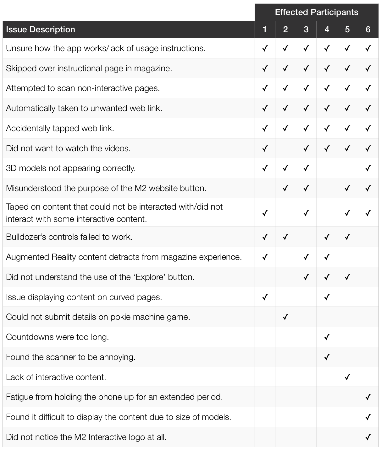
Below is a list of issues experienced, along with a list of effected participants. The list is ordered descending by the number of effected participants, with the more prevalent issues displayed at the top of the list.
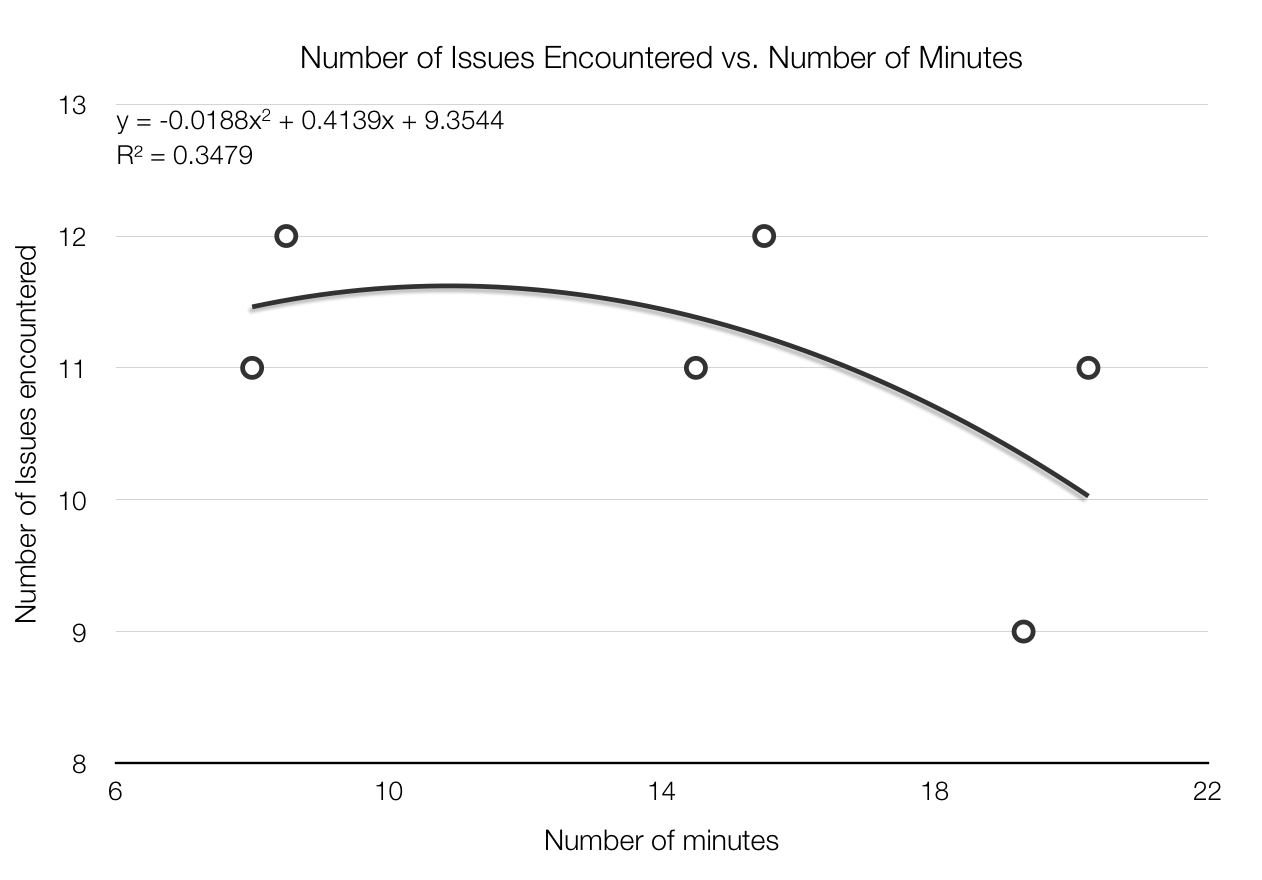
Issue Chart

Notable Trend

By plotting the number of issues a participant encountered against the number of minutes they spent in the application a negative, Polynomial trend can be observed. This trend suggests that users that spent more time in the application encountered less errors.

It is suggested that perhaps some of the issues encountered by the participants are caused by user-error, resultant from the user not spending enough time in the application to execute the tasks in the way they were designed for.

Trend Chart

Common Usability Issues

Of the twenty different issues experienced across the six participants, five issues were experienced by all participants during their use of M2 Interactive.

All users skipped over the instructional guide on page 8 of the magazine, and were unsure how to correctly use the application. As the app does not include an on-app user guide, every participant learnt how to use the app by trial-and-error. During their learning experience, every participant attempted to scan non-interactive pages of the magazine. They also accidentally tapped on a web link button, and were all unwillingly taken out of the app and into the web browser.

Five of the six participants did not wish to watch the videos, as they were uninterested in this type of media. Four users experienced issues with 3D models not appearing correctly, and two of those participants found the curve of the page to be partially responsible. Four users misunderstood the meaning of the M2 website button, and four users either attempted to tap on non-interactive content, or did not know to tap on interactive content.

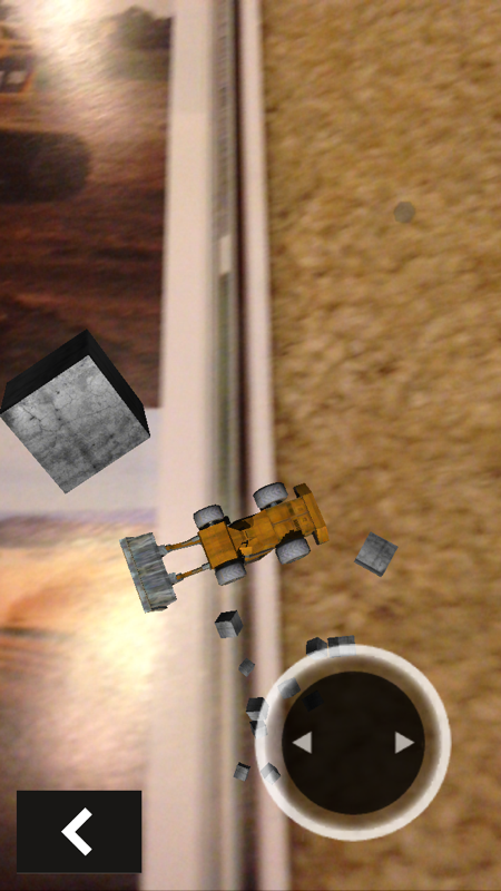
Three participants were unsure about the purpose of the ‘Explore’ button; this includes the single participant who had experienced Augmented Reality previously. All participants that attempted to play the bulldozer game were unable to due to faulty controls.

M2 Interactive menu Crooked pokie machine Crooked helicopter Faulty bulldozer

Unique Usability Issues

The single user that was able to win the 'pokie' game was unable to submit their details due to the app crashing. All other participants that attempted the 'pokie' game were unable to win.

One participant commented that the countdowns on some content were too long. The same participant also claimed that the scanner interface was "annoying." One user stated that the app lacked interactive content, though they also incorrectly interacted with some content during the test.

Participant 6 had three unique issues. They experienced fatigue from holding the phone for an extended period of time, found displaying the content to be difficult due to the irregular sizing of the 3D models and did not discover the M2 Interactive logo in the magazine at all.

Discoveries About Human Computer Interaction

Multimodal Systems
The observations from our study draw into attention the multimodality of the system. The app features various modes of multimedia with textual and audio-visual content, some with user input and some without. Some subjects of our testing stated they were distracted from the magazine by the app and became more disinterested with the magazine.

A review by Maragos, Potamianos & Gros (2008) explains the human “need to extract multi-level information about the structures and their spatio-temporal or cognitive relationships in their world environment.” Explained further, we are stimulated by our sensory organs to derive our perception of the world. The more sensory organs are stimulated, the more we are drawn towards them. Such as our visual, audible and haptic sensors are excited with the interface of the application, we are detracted from the less stimulating media.

Inconsistent Behaviour/Features
Some augmented reality features were interactive while some were not, leaving the user in a state of confusion. During our experiment, we noted the number of subjects tapping on the screen during non-interactive content, and not tapping on some interactive content. While testing the AR feature on the bulldozer page, subjects were confused as how to move the vehicle. Although the subjects knew that it was interactive, due to the appearance of a button on the user interface, it was noticed that the users still did not manage to manoeuvre the vehicle in the way they would like to. Accelerating the bulldozer was not obvious; the user had to use position one finger on the button to control steering and another on the screen, off the button to accelerate. Thus, this task proved difficult for most subjects.

Livingston (2013) states, “Careful and detailed study of perceptual factors first lead to optimal performance or configuration of component technologies, and then more cognitively-demanding tasks are used for evaluation of (complex pieces of) the system.” In relation to our study, we derived poor performance was a result of the misguided perception of control input and therefore were unable to evaluate whether the task of manoeuvring the bulldozer was effective e.g. in terms of sensitivity in control, speed and dynamics.